
The desire for retail traders to improve their winning edge in the market by getting access to "institutional-grade" tools is increasing daily. That has led to the increased use of order flow and the development of the Footprint Chart.
Now ask yourself: How were the big banks making money in an era without computers, or when the best available computers were those slow, gigantic processors that filled an entire room? They used order flow, which is how they knew where the market was heading.
This article will teach you the rudiments of Order Flow and Footprint Charts, what they look like, how they work, and how to use them to improve your trading outcomes.
Most of you reading this are used to traditional price charts (candlesticks, bar charts, line charts) and regularly use them on your trading platforms. These charts show price history but do not reveal trading volumes or other valuable information that indicates where the large orders are coming from or headed to and when they are entering the market (order flow). Therefore, a critical piece of the price puzzle is missing: the "why" of price movements.
For this reason, a new way of price representation has been developed. By incorporating order flow information and using footprint charts, traders can, as it were, "see inside" market mechanics and take action when the big moves are occurring.
An order book is a broker's electronic list of all buy and sell orders for any financial instrument traded in the market, arranged according to the order size and the price level.
Brokers and exchanges use an order book to make price discovery transparent and enable seamless trade execution in the market. Before launching the Depth of Market tool on the MT5, retail traders had zero information about where the large-volume trades were buying or selling. That information is now available.
The market price is usually displayed in a different column and represents where the Bid and Ask prices come together (willing buyer, willing seller meet). Also displayed is a collection of orders at various prices, indicating the Depth of the Market.
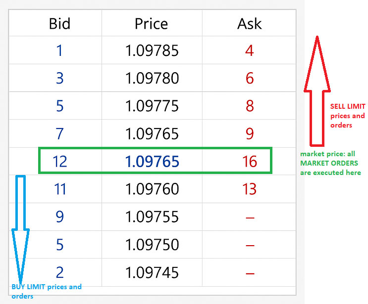
When you look at the Order Book of the MT5 platform, which you will get with the brokers listed on this site, there is a column for the bid price, a column for the price, and a column for the ask price. The numbers you see on the Bid and Ask columns are the number of orders on the Order book for market and pending orders. Each row will show the price and the number of orders in the Bid or Ask column.
The order numbers in the Ask column are for Sell orders. These orders are executed when a trader buys at a particular price. The order numbers in the Bid column are Buy orders, executed when a trader decides to sell at a particular price. On the MT5, the 1-click facility allows you to buy at Ask or sell at Bid by clicking on any of the order numbers listed on the row displaying the price you are interested in.
Notice that one price is marked in a separate colour: the market price, and any orders executed here are MARKET ORDERS. Any orders above and below the market price are pending orders. Whichever pending orders are limited or stopped will depend on your trading direction.
For instance, suppose you have the following order scenario:
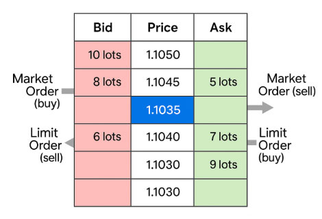
What this means is that:
The order book is updated in real time as the flow of orders continues and is executed, added to, or removed from.
The FX market is like any other market, where the balance of supply and demand determines price. As long as the balance or equilibrium is maintained, the asset's price is at fair value. This means that there is enough supply to match the demand. When price is a fair value, you see it displayed on the charts as a sideways/range-bound market or market in consolidation.
However, whenever this balance is distorted, prices change rapidly and move away from the fair value level or range. This is when the market starts to trend as it seeks a new fair value. Change in fair value usually comes when there is new information in the market, either from news, geopolitics, or macroeconomic data. When demand outstrips supply, this pushes the price into an uptrend. When demand dries up and drops below supply, prices fall, and you see this as a downtrend.
The problem with the regular methods of price action display (candles, bars, line charts) is that they only show you the outcome of the supply-demand changes over time. Essentially, they only show the outcomes of these interactions and fair value changes. They do not show you the underlying microstructure. It is like seeing a completed building to purchase, and buying it without knowing if it will develop foundational issues, rising damp, or cracks. The only way to know if that building will stand the test of time is by knowing if the underlying process that came into play before that building was erected was done correctly: soil tests, foundation, structural and architectural designs, etc.
So it is with order flow. It is about knowing the moves behind the move.
A new method of price representation has been developed, which takes the order flow information in the order book and places it in the candlestick. This is known as the FOOTPRINT CHART. Here is an explanation of how the volume footprint works concerning a bullish candle. We see a bullish candlestick on the left, and its accompanying volume footprint chart on the right.
The volume footprint chart has columns (vertical) and rows (horizontal).
There are usually several rows, with each row representing a price level.
There are always two columns, showing buy and sell orders.
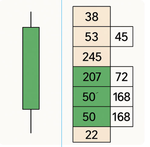
Now look at these:
► Lower Levels:
Look at the bottom three rows. They show that price action starts on the candle, with low sell volumes of 22 and 50 and rising buy volumes of 168 and 168. This shows good buying interest at the lower price levels (easy to see from the figures). At this stage, the bulls are absorbing sellers.
► Middle Level:
The middle price level shows a row with 207 orders on the buy side, compared with just 72 sell orders. This rising imbalance shows that aggressive buying has begun. This causes the price to rise, displayed as an elongation of the candle to the north: a bullish candle.
At this stage, an imbalance between demand and supply has developed in favour of demand, and prices rise in search of a new fair value. This volume imbalance is also known as a delta-positive situation.
► Upper Levels:
The upper levels here show a situation where buying volumes increase. We can see two levels with 245 sells and 0 buyers, 53 sellers and 45 buyers, and 38 sells with no buyers.
Buying has become less aggressive and indicates profit-taking. At this stage, you have no business buying the asset unless you deliberately want to give up your money to the sellers.
The comeback in selling pressure is responsible for the rejection displayed as the upper shadow, the difference between the high and closing price. The volume footprint of subsequent candles shows whether or not the price continues to rise.
You would not make a buy or sell decision based on just one volume footprint chart. You would look within the context of trends. We now demonstrate what happens when the volume footprint of a sequence of candlesticks is used to pick out a trading opportunity.
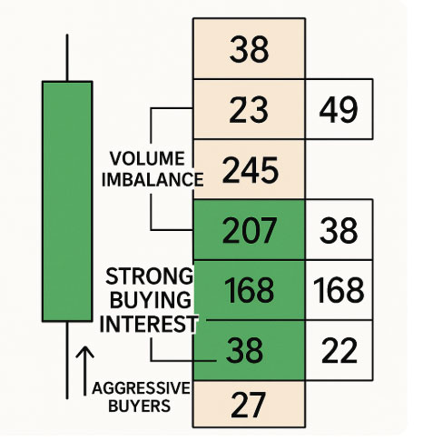
Here is a description of how the candlestick and volume footprint charts can help you get a deeper picture of market activity.
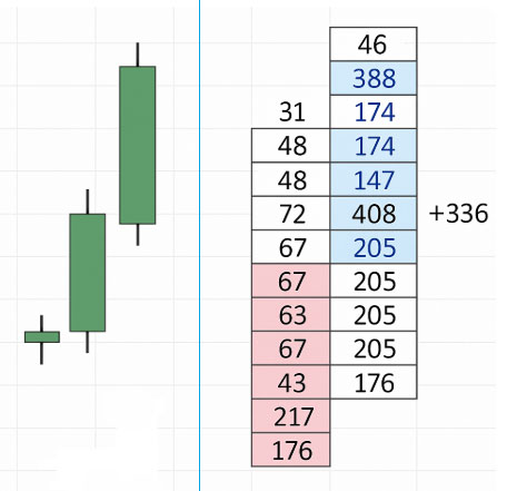
► On the left: Candlestick
► On the right: Footprint Chart (Volume at Price)
This volume footprint chart is the same as the bullish candles on the left, but with new information added. As usual, there are two columns and several rows.
A. Dominant Buying Pressure:
B. Positive Delta:
C. Absorption and Continuation:
D. Cluster of Volume:
E. Bullish candle + rising buy volume + positive delta: the trader should consider going long.
Repeat the same sequence in reverse for short positions (bearish candles + rising sell volume + negative Delta).
Order flow charts track the real-time market flow, limit orders, and volume at a particular price. They show any imbalances between Bid and ask price, aggressive/high-volume orders, levels of absorption and exhaustion, and the difference between buy and sell volume, also called the volume delta. You can also spot the overall buying vs. selling pressure trend over a specified time frame.
Order flow charts help the trader spot institutional activity EARLY. The emphasis is on early because if you can spot the volumes that move the market early and jump in, you can ride the trade for huge gains, following all risk management principles.
Order flow comes from centralized order books, making them a more reliable indicator for institutional volume activity. Note that a centralized order book displays all buy or sell orders, market, and pending, so there are no hidden or dark book orders anywhere. With this information, you know what prices the huge orders are, and what they are (buy or sell, market, or pending orders).
The Volume Footprint charts translate the information in the order book into a price chart that you can trade off of. The footprint chart resembles a candlestick, but contains the price levels within the candlestick and the orders at each price level.
Footprint charts are available from Bookmap, Sierra Chart, ATAS, Quantower, and Tradingview (all require premium subscriptions).


